February
21st,
2008
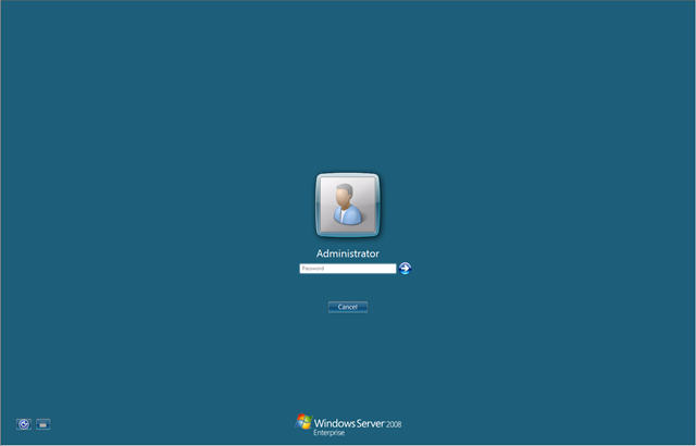
Am I the only one that thinks the Windows Server 2008 logon screen, with it's very simple blue background, is so much better looking that Vista's ugly and distracting "aurora" background?
There's just something highly appealing to me about keeping things simple and elegant...
Technorati tags: Windows Server 2008
