
Every once in a while someone voices their surprise when they try out one of my Visual Studio Color Schemes and find that all those very large fonts I leave by default on most of them [1].
I've been using Damien Guard's excellent Envy Code R font, usually at 15pt size, which I'm sure looks huge on some screens. It took some time for me to get used to it, as well, but I wouldn't change it now.
The reason I started using large fonts when writing was readability. I've been mostly a laptop user for a number of years now, but a couple years back I started using one with a high-resolution (1920x1200) screen.
Having that much screen real state is fantastic, particularly on a large screen, but it can be a bit hard on a 15.4" laptop screen because most things will look pretty tiny. I have good eyesight, but looking at really small text for prolonged hours can really make your eyes (and your brain!) sore.
Instead of just fiddling around with the Visual Studio fonts, the ideal solution would've probably been to adjust the screen's DPI settings accordingly (120 DPI), but the truth is that, right now, that's not really an option on windows if you don't want a lot of applications to (a) look like crap or (b) become unusable because not all the controls fit into the display. Unfortunately, most Windows applications aren't really ready to work with high DPI settings and/or large system fonts, so this isn't as good an option.
However, it turns out that you don't really spend most of your time looking carefully and closely at all applications were text might be small. Instead, you spend most of your time in a few key applications, and simply increasing the font size for those can really make a difference in how you feel at the end of the day.
In my case, those applications are Visual Studio, Vim, Console and Firefox. The first three are easy to set up, and that's why most of my VS settings files include large font sizes for all the key elements (the editor and tool windows).
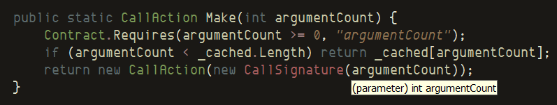
Tip: If you like/need large fonts in VS, increasing the font size of your tooltips can also make a big difference. This is something I used to do but always forgot to change and make sure my theme files included this setting. The screenshot above uses 11pt Tahoma for the tooltips.
Firefox is a bit harder to set up right, because changing the default fonts used can break a bunch of sites. Fortunately most of the web sites I visit regularly are very friendly to the use of Ctrl-+ to increase the font size.
The downside of using large fonts
There's obviously a downside of using large fonts when programming: You can fit less lines on a screen. Usually, the increased width of text doesn't matter much, particularly on a screen with wide format because there's so much horizontal space. Vertical space, however, is a different matter because it means you can display a lot less lines at at time.
For example, on a full screen VS session using Envy Code R, I can view 55 lines at a time at size 10pt, but only 40 at 15pt. That's 27% less lines!
It's not that I write methods with hundreds of lines, mind you. It's just that even if all your methods are short, sometimes you do have to deal with longer code files. It might be that you have classes with a lot of short methods, or maybe you're dealing with legacy code that's not so nicely factored.
Having a large screen with smallish fonts can make it a lot easier to work on these kinds of scenarios, because navigating and making certain changes/refactorings is a lot easier (even with automated tools for that). For example, one scenario were I really wish I had a larger screen is when dealing with source files that have several shorter classes defined in it (not all people are fans of the "one class per source file" convention).
The solution, of course, is to get a larger screen. For this reason, one of my goals for this year is to get a new desktop machine (after several years desktop-less) with a decent, large LCD. I'm aiming for a 24" display so that I can keep using the 1920x1200 resolution. The downside, of course, is that they are pretty expensive around here, so I still need to save some money before I can afford one alongside with a decent desktop machine.
[1] If you were also surprised about the "15pt Courier New" font; look closely and make sure you install the right font, or replace by your favorite :-)
