November
12th,
2007
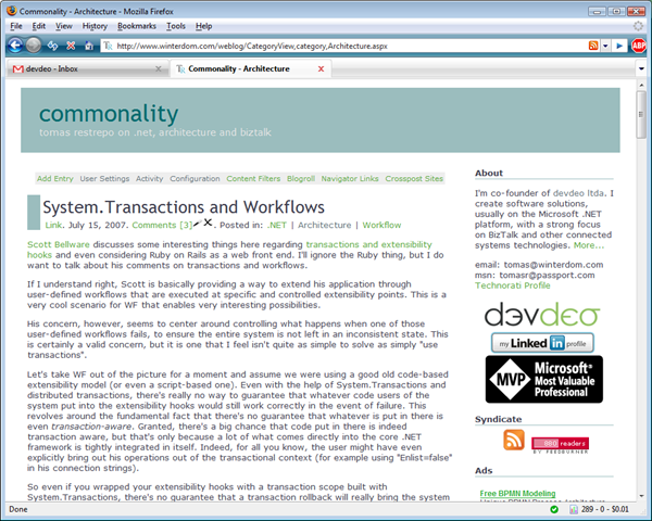
I had redesigned my weblog looks back in July, but got bored with it now. It looked fine, but the colors were a bit too strong and the design a bit too complex. I really wanted something a lot more straightforward, that used space more effectively and with softer colors. Here's the result:
It's a very simple, minimalist theme, and I'm rather liking it for now. Still some tweaking it a bit, but it seems to do the trick!
Technorati tags: Blogging
